Design: UI Component Definitions
Wir nutzen folgende Typen-Namen bei der Benennung unserer UI Komponenten:
Input
| input | 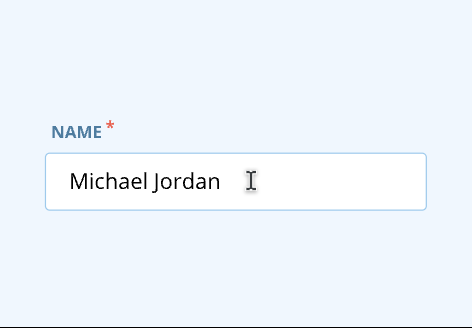 | A input enable the user to interact with and input short content and data. |
| numberInput | 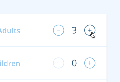 | The number input can be designed in different ways, either as an Input, or a Label with increment and decrement buttons next to it. This component requires less effort than selecting the input field, tapping the digit “2” on the keypad, and hitting Enter or dismissing the keyboard. |
| textarea | 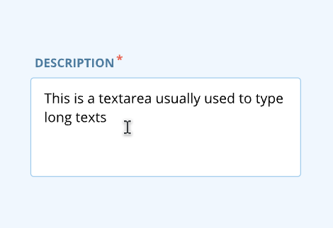 | Similar to the Input component, enable the user to interact with and input long content and data. |
| checkbox | 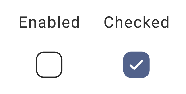 | Checkbox are used when there are multiple items to select in a list. Users can select zero, one, or any number of items. |
| radio | 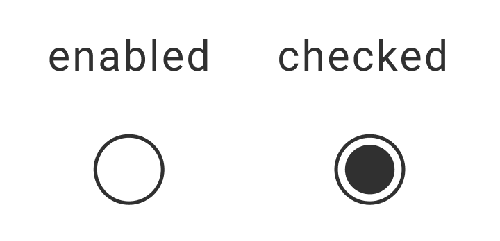 | Use Radio to select a single option from a list. Radio should be used instead of checkboxes if only one item can be selected from a list. |
| slider | 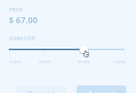 | Sliders provide a visual indication of adjustable content, where the user can increase or decrease the value by moving the handle along a horizontal track. |
| button | 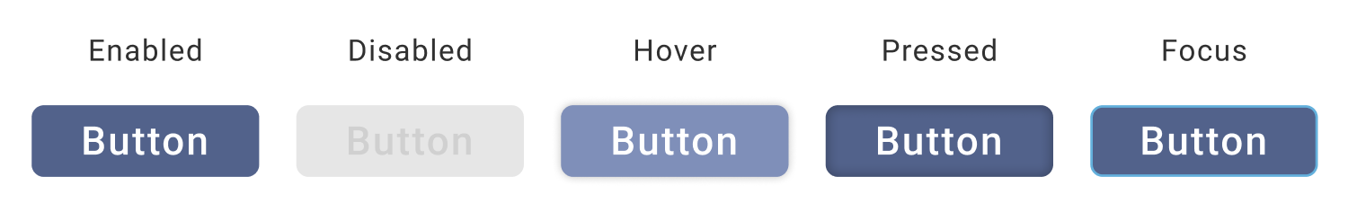 | Buttons are used to initialize an action. Button labels express what action will occur when the user interacts with it. |
| toggleButton | 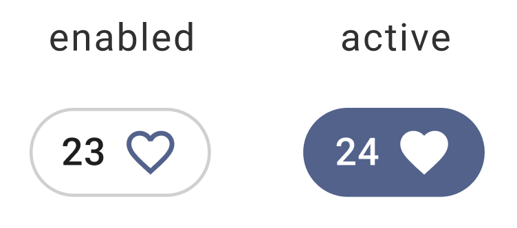 | A toggle button allows a user to pick between 2 states, enabled and active. |
| switch | 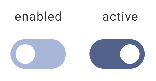 | Switch represents a physical switch that allows users to turn things on or off, where choosing an option results in an immediate action. |
| select | 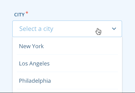 | Users can choose from a list of options that appear in a dropdown. The two states of select are collapsed and expanded. |
| comboBox | 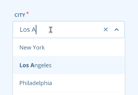 | Similar to select but allowing the user to edit the input field in order to sort through the list of options. The two states of a combobox are collapsed and expanded. |
| search | 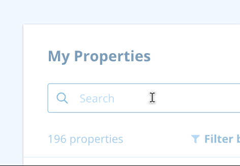 | Search enables users to specify a word or a phrase to find relevant pieces of content or filter a long list of elements. |
| datePicker | 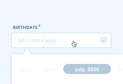 | A Date Picker is a text input to capture a date. You can select a single date, date range or date and time. |
| colorPicker | 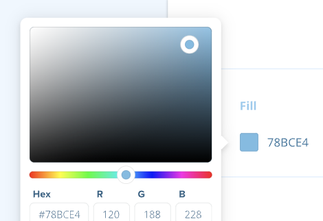 | The color picker allows for multiple methods of selecting a color. |
| fileInput | 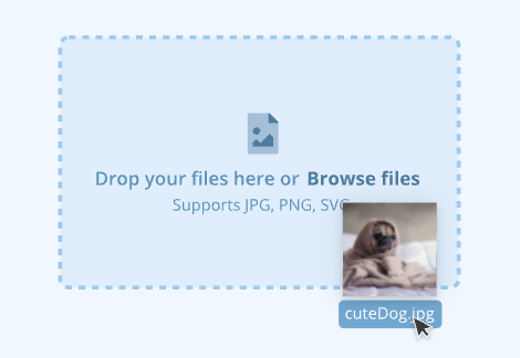 | The File Input allows a user to transfer a file or submit content of their own. |
| rating | 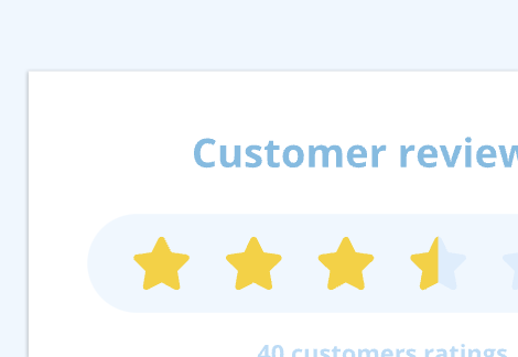 | The rating provides insight regarding people's opinions of a product, service, or experience. Users can also rate what they've purchased. |
| floatingAction | 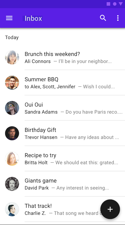 | A floating action button appears in front of all screen content, typically as a circular shape with an icon in its center. |
Notification
| alert | 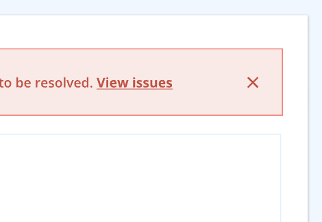 | Generally, an alert displays a prominent message at the top of the screen. It could be used to promote a new feature or provide action-based feedback messages. They’re persistent and nonmodal, allowing the user to either ignore them or interact with them at any time. |
| toast | 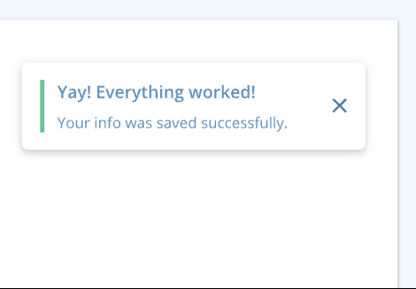 | Toasts are shown as a floating box typically in the top right of the page. They can optionally be displayed on other edges of the screen (top-left, top-center, bottom-left, bottom-center, or bottom-right). Toasts provide limited space for content, and therefore the content must be short and concise, providing immediate feedback in response to a user action or informing users of a process that the app has performed or will perform. Disappear automatically or can be dismissed by the user. |
Navigation
| link | 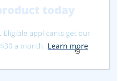 | Links are used as navigational elements. They may appear on their own, within a sentence or paragraph, or directly following the content. |
| dropdownMenu | 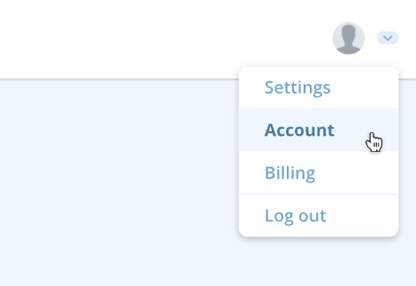 | This component presents a list of options that take immediate action or navigate the user outside of the current context. It can be thought of as a collection of links or buttons. States can be collapsed and expanded. |
| tabs | 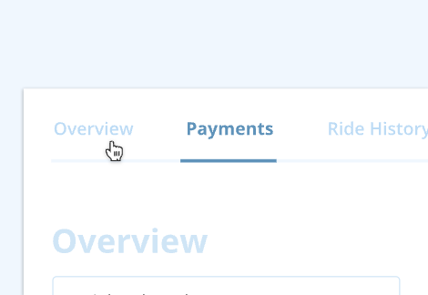 | Allows users to navigate easily between views within the same context. States can be enabled and active. |
| breadcrumb | 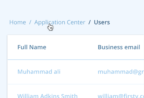 | The breadcrumb is a secondary navigation pattern that helps a user understand the hierarchy among levels and navigate back through them. |
| pagination | 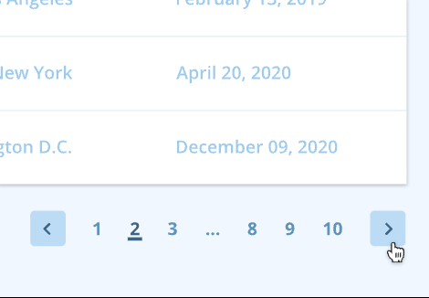 | Pagination is used for splitting up content or data into several pages, with a control for navigating to the next or previous page. |
| accordion | 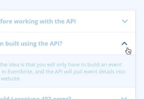 | An accordion displays summary information that can be expanded to reveal content or collapsed to hide it. Can be used to group or hide complex regions to keep the page clean. States are collapsed and expanded. |
| carousel | 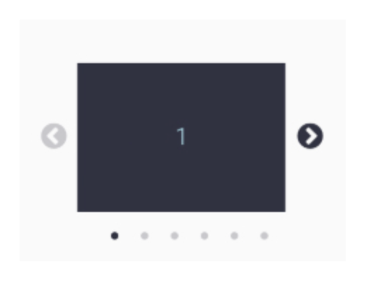 | Carousels are for displaying a related set of content items in a row. Items can be paged using the next/previous buttons or by a swipe gesture. |
| collapse | 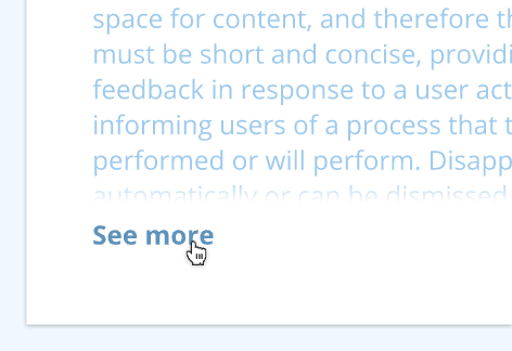 | The Collapse component shows and hides content in long sections of information. Also, this is useful for hiding optional subforms or extra content. States are collapsed and expanded. |
| stepper | 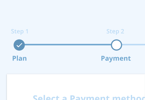 | A stepper is a visual representation of a user’s progress through a set of steps, indicating how much the user has completed or how far they are from completing a task. |
| sidebar | 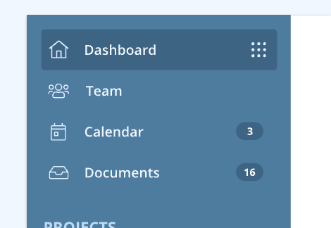 | Is represented by a side panel (it can be on the left or right side of the screen), which lets users navigate the entire content of a product or a section, generally an in-page navigation. It can be fixed and visible on the screen, or it can be collapsed, which appears from a side of the screen, triggered by a button. |
| appBar | 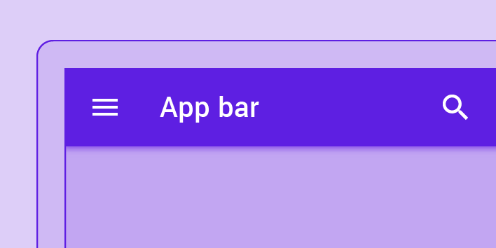 | The top app bar provides content and actions related to the current screen. It’s used for branding, screen titles, navigation, and actions. |
| navigationBar | 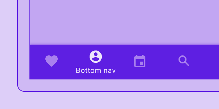 | Bottom navigation bars allow movement between primary destinations in an app. Bottom navigation bars display three to five destinations at the bottom of a screen. Each destination is represented by an icon and an optional text label. When a bottom navigation icon is tapped, the user is taken to the top-level navigation destination associated with that icon. |
Loader
| spinner | 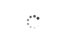 | A Spinner is an outline of a circle which animates around itself indicating to the user that things are processing. Use a Spinner when the content to be loaded is unknown or unpredictable. |
| progress | 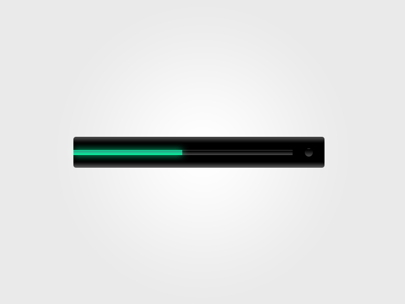 | A Progress is a linear indicator for providing feedback about an ongoing, user-initiated process. |
| skeleton | 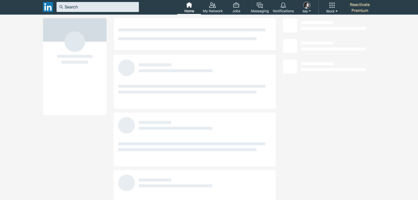 | Skeleton provides a low fidelity representation of the user interface to visually communicate that content is in the process of loading. Some studies indicate that Skeletons can reduce the user's perceived loading time. |
Overlay
| modal | 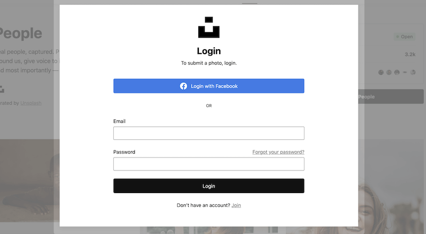 | Modals focus the user’s attention exclusively on one task or piece of information via a window that sits on top of the page content. It makes the user's response a requirement. The user is required to choose an action and there is no option to ignore or dismiss the message. |
| dialog | 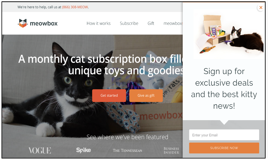 | Speaks to the user and requests for the user's response. User could opt to ignore or dismiss the message. |
| tooltip | 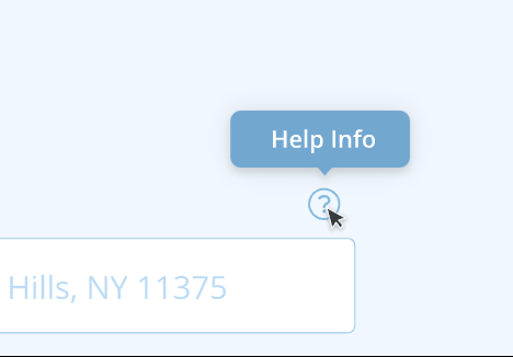 | A tooltip is a floating, non-actionable label used to explain a user interface element or feature. |
| popover | 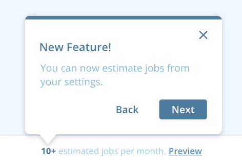 | The Popover component displays floating informative and actionable content in relation to a target. Popovers appear either at the top, bottom, left, or right of their target. |
Content
| list | Lists are continuous, vertical indexes of text or images. | |
| table | 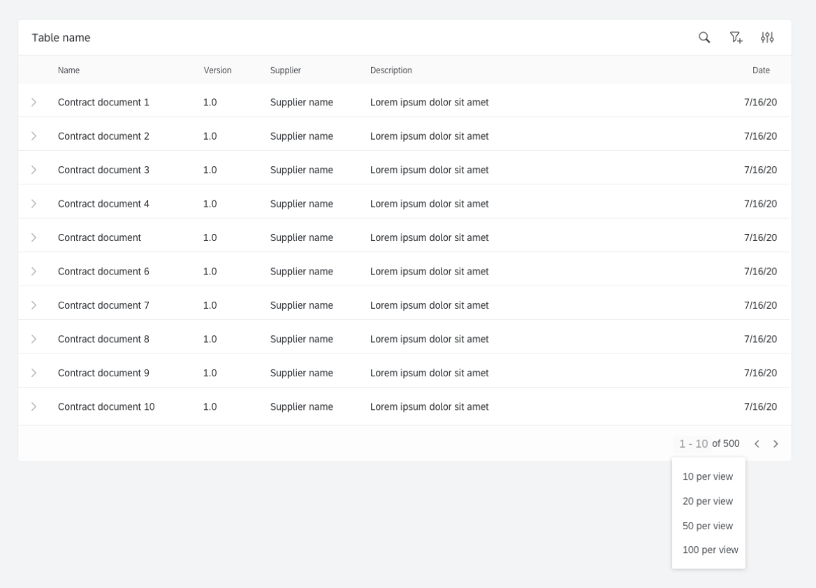 | Table is a container for displaying data efficiently. Usually, it allows users to sort, search, paginate, filter data, and take action on large amounts of data. |
| card | 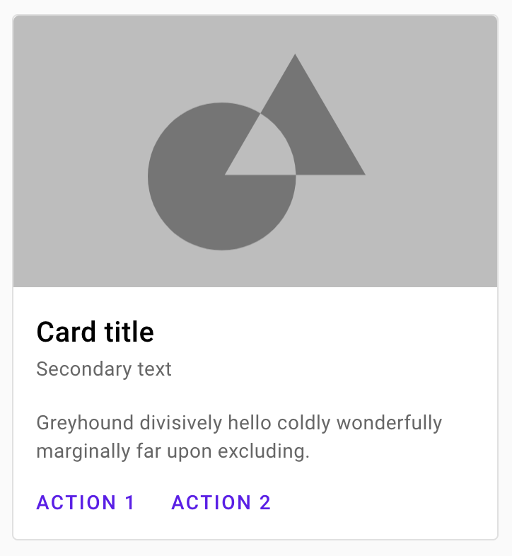 | Cards are used to group information about subjects and their related actions. Cards can include images, text, buttons, links, and data visualizations. |
| calendar | 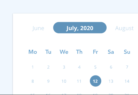 | The Calendar component is used to display information on a daily, weekly, or monthly view and pick a date value. |
| avatar | 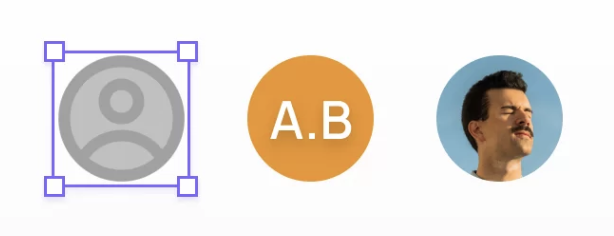 | Avatars are used to show a thumbnail representation of an individual or business in the interface. |
| badge | 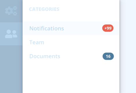 | The Badge component is a visual indicator for numeric values such as tallies and scores. |
| divider | 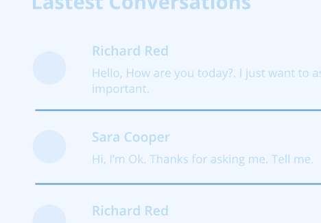 | Useful for displaying a visual separator between parts of content. |
| tag | 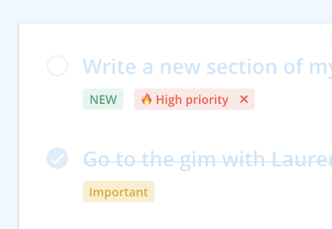 | The Tag component is useful to emphasize information to the user, works best with single word values. |
| emptyState | 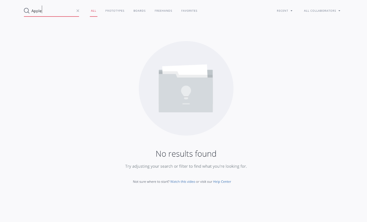 | This component is used for presenting various empty states, such as no items, empty search, broken link, welcome screen, etc. They are most commonly seen the first time a user interacts with a product or page, but can be used when data has been deleted or is unavailable. An empty state is an opportunity to engage and delight users adding an actionable button. |